After last weeks review of my site, I have decided that it is finished. I am happy with the look and the functionality of the site and it will only need updates as my work progresses. Please feel free to take a look at my site and submit comments through my contact tab.
amandameng.com
Monday, March 21, 2011

Sunday, March 6, 2011
Fixing My Portfolio
I had already had the setup for my portfolio in place but after some review, I needed to update both my home and portfolio landing pages and create a coherent and consistent look for each individual portfolio page. To accomplish this, I created the code below as my landing page. This page will be updated frequently to allow the viewer a quick glance at all the new things I have been up to and give them easy access to them without using the side navigation (which they can still use if they want to). I also made my header a link that will bring the user back to my homepage at any time. Below is the Code and the final result:
Monday, February 21, 2011
What I have so far
I have been very busy working on my site. I have mainly been focusing on my portfolio section but I have also been semi-updating my home page too.
 After reviewing what I have done with some friends and family, I have decided that some changes need to be made by next week. Here are the main problems with the site:
 After reviewing what I have done with some friends and family, I have decided that some changes need to be made by next week. Here are the main problems with the site:
- Too White - I need either some background color or some other elements to add a more design feeling.
- Too Boxy - Everything is trapped in a box. Maybe adding a background will help this. If not, I will need to find another solution.
- Portfolio Nav in Sidebar too Restricting - I need to have more options for viewers. I am thinking of creating a standard nav bar as a library asset and placing it in the different pages. This standard nav bar will have thumbnails of all the different projects.
- Update Projects and Standardize Pages - I need to update some of the photos, descriptions and thumbnail shots. I need to make all page layouts similar so that they work together.
Monday, January 31, 2011
New CSS and Unordered LIsts
Attaching external CSS pages is essential to good website design. For my site, I have two style-sheets attached. The first is the one most people see. It is the default style-sheet that will format the pages for internet viewing. This one includes all the fancy stuff such as the pull out button navigation and the general formatting of the page. The second style-sheet is the print style-sheet. This style-sheet tells the computer how to print the page in a clean and orderly manner because most people don't need all the fancy formatting for printing.
In designing the navigation for my site, it was essential to use unordered lists. In this unordered list, there is a special id to specify to the CSS how to respond to this special navigation list.

In designing the navigation for my site, it was essential to use unordered lists. In this unordered list, there is a special id to specify to the CSS how to respond to this special navigation list.

Monday, January 24, 2011
Revisiting Target Market
Target Audience Research
In creating a new portfolio site, it is important to first ensure that my “target market be clearly defined” (Lake). The target of my site as a whole is to gain the attention of potential employers and peers and to begin conversations about my work.The target audience of my site is potential employers in the web and graphic design fields. I want to especially focus on the web and packaging industries. I intend on applying for employment at larger firms and companies so my site must look professional as well as demonstrate my skills and my playful and creative talents. I do not wish to work at an overly conservative location so some bending of the rules is acceptable. My future employers are looking for someone who is web savvy and up-to-date on the current digital trends. On the Turner Duckworth site, they claim they are looking for designers that are “confident, self-sufficient, articulate and motivated students with a strong ability to concept - a bit of wit and a sense of humor doesn’t hurt either!” (Turner Duckworth). Keeping that in mind, I need to create a site that is easy to navigate, displays information clearly and showcases my creativity and personality.
Sunday, January 16, 2011
Winter 2011 - Inspiration for a New Year.
For the new year, I have decided that my website needs some serious work. I have abandoned my old address from school and created amandameng.com. This will be my home-base for all future projects.

I have also been working on a more useable layout that is more tailored to a target audience. I have been researching interesting layout design and hope to make my site more visually appealing. Here are some sites I have been looking at for inspiration:
Tuesday, September 21, 2010
Final css Zen Garden site
For my final Zen Garden site, I chose to work in a darker color palate than I normally would. My goal was to create a deep jungle theme without using overtly jungle imagery. I accomplished this by using a dark gray background with rich green accents throughout the page. For the background, there is a hint of foliage.

My site will stand out from the rest by being bold. The layout has a structure which creates an environment that is easy to navigate and access. The visual hierarchy is simple to understand which makes my page have readily accessible usability.
The wide area of the body text makes the mass of information seem less daunting. I chose to widen this area because I noticed in the other designs of this site, the information became very intimidating because of its length.


My site will stand out from the rest by being bold. The layout has a structure which creates an environment that is easy to navigate and access. The visual hierarchy is simple to understand which makes my page have readily accessible usability.
The wide area of the body text makes the mass of information seem less daunting. I chose to widen this area because I noticed in the other designs of this site, the information became very intimidating because of its length.
Tuesday, September 7, 2010
Hello Zen Garden!!
I am going to work on the CSS Zen Garden site. CSS Zen Garden is a place to practice new and innovative ways to use CSS to enhance an HTML page. To use this site, you first download the plain HTML and without changing it, add custom CSS using the div tags provided and there you go: you are on your way to being a CSS Zen Master.
This is my prospective wireframe for my upcoming CSS Zen Garden project. I want the side bars (in red) to be stationary and have all other information elastic and scrollable.

This is my prospective wireframe for my upcoming CSS Zen Garden project. I want the side bars (in red) to be stationary and have all other information elastic and scrollable.

Tuesday, August 31, 2010
Working on the Site
I am making progress on my website. I am especially proud of my new portfolio page. I created it for usability and visual appeal.
And now for my intended audience: My goal is to appeal to potential employers in the branding and packaging fields of graphic design. I LOVE packaging and I have been working really hard on creating a portfolio site that is able to allow employers to get both the visual aids and written words to express how great my stuff is and that I love to do it.
Visit my portfolio page now!
And now for my intended audience: My goal is to appeal to potential employers in the branding and packaging fields of graphic design. I LOVE packaging and I have been working really hard on creating a portfolio site that is able to allow employers to get both the visual aids and written words to express how great my stuff is and that I love to do it.
Visit my portfolio page now!
Tuesday, August 24, 2010
Reading Wired "How the Web Wins"
I was reading "How the Web Wins" on the Wired website and found it interesting how they compared apps to the web. I find them not so easy to compare.
I believe that apps can be qualified as both part of the web and different things altogether. As a huge fan of "Angry Birds," "iTunes" and all apps created by Duck Duck Moose (for my son) I do not believe that the raw web is capable of replacing apps on my mobile phone. Apps for children are nice because it is easy to hand my phone to the little person in the back seat on long car trips and let him play without worrying what he is looking at. They are very simple to navigate that even a one and a half year old can do it.
I am very happy that apps are pushing web designers to achieve more in their usability and design. I am excited to see what the future will bring.
"How the Web Wins"
I believe that apps can be qualified as both part of the web and different things altogether. As a huge fan of "Angry Birds," "iTunes" and all apps created by Duck Duck Moose (for my son) I do not believe that the raw web is capable of replacing apps on my mobile phone. Apps for children are nice because it is easy to hand my phone to the little person in the back seat on long car trips and let him play without worrying what he is looking at. They are very simple to navigate that even a one and a half year old can do it.
I am very happy that apps are pushing web designers to achieve more in their usability and design. I am excited to see what the future will bring.
"How the Web Wins"
Friday, August 13, 2010
Floating Around
So I am learning now about how things can float. Floating is just a fun way of saying how something is aligning left or right and is gently moving other things out of the way.
First I chose three random images and some dummy text. I went through the motions of aligning two images with their teasers like so:

I was following along the example given in the book but for some reason could not get it to work properly. I double, triple and quadruple checked it so I believe that their is some strange flaw in their coding that I am too novice to figure out. I was not able to keep all text aligned at the 98px border without moving the image using the code from this book.
Here is my code:


I posted an example of this page to my website if you want to check it out.
Tuesday, August 10, 2010
Fun with Templates
Templates are amazing things. You can make one page, create a template from it and make as many other pages from that template as you want to. You can create your template so that only certain parts of the page will be editable. Anytime you update this template, it will update all the pages created from the template. Wonderful!!
I plan on using this trick for my homework sites from now on (unless an assignment requires something different).
Check out my homework site to see an example (note: it is under severe construction but will give you a rough idea of what I mean).
I plan on using this trick for my homework sites from now on (unless an assignment requires something different).
Check out my homework site to see an example (note: it is under severe construction but will give you a rough idea of what I mean).
Tuesday, August 3, 2010
Creativity Time
I love inspiration. It is always good to see new and refreshing designs. I found a new site that has inspiration for both web design and graphic design. http://designtutorials4u.com. It inspires me to keep working on my website and it inspires me to push myself to be more creative in my packaging projects. This page has been a good vacation from designer's block.
Packaging is my one true love. I could design boxes, bags and bottles all day long.
Packaging is my one true love. I could design boxes, bags and bottles all day long.
Mapping the New Site
The beginnings of my website happen here:

This is the preliminary mapping of my future site. This will allow me to accurately code the css to get all the stuff in my site where I want it to go.

This is the preliminary mapping of my future site. This will allow me to accurately code the css to get all the stuff in my site where I want it to go.
Saturday, July 31, 2010
Converting Tables to Divs
Converting tables to divs is a lot more difficult than I thought. I was trying to convert this page's tables to divs. It took me hours and hours of staring at this stupid table, brainstorming and browsing online tutorials to find the answer. The problem was that there were too many answers and none that were specific to my problem.
So I made up my own way that looks like this. I made one main div that held two alternating divs and then created a class to turn alternating div rows gray. I am not sure if this is in any way correct but it seemed to work for me. The only problem I have with it is that I can't seem to figure out how to make the dark gray date bars go the length of the content. Any help?
Once again, I posted to: http://adfrink.aisites.com/mm2203/tables%20to%20divs.html
Tuesday, July 27, 2010
Measuring with the Box Model
I have been studying the Box Model for calculating the space any box will take up on a site. A box in a website is just a container that holds things like the text or images. This means that if you want to put some text on the page, you will have to calculate the area the text will take up, the padding, the border and the margin space. The total area can be best shown by the illustration below:
 For example, If my content is a width of 200px, I put 15px padding, a border of 5px and a margin of 5px, my content box will be a total width of 250px (200px wide + 2(15px padding) + 2(5px border) + 2(5px margin).
 For example, If my content is a width of 200px, I put 15px padding, a border of 5px and a margin of 5px, my content box will be a total width of 250px (200px wide + 2(15px padding) + 2(5px border) + 2(5px margin).
Creating Elastic Type
As I mentioned in my previous blog, I have been studying elastic text in designing my new website. This is a sample of what I wanted to accomplish using css to optimize the flexibility of my text:
 I accomplished this by creating a page with simple HTML and an attached style sheet.
My style sheet specifies what each element of my text should look like.
 To see the sample page click this link.
 I accomplished this by creating a page with simple HTML and an attached style sheet.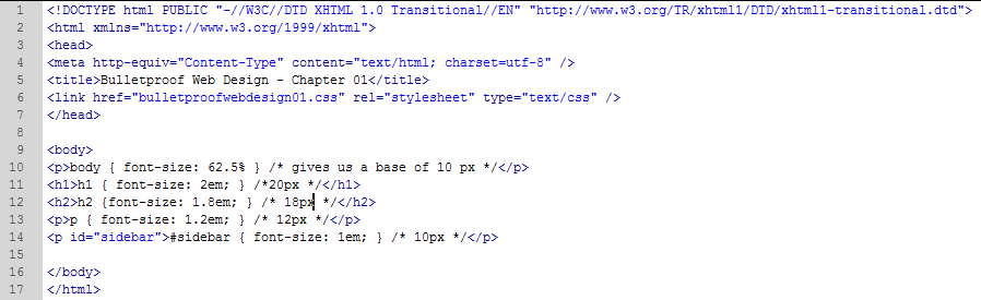
My style sheet specifies what each element of my text should look like.
 To see the sample page click this link.
Converting Pantones to RGB
Hello Blog,
This week I have been working on color schemes, Pantone conversions, the box model and playing with type size. It has been a very busy week for me.
First off, I have chosen a color palate for my website in Pantone colors and found what those colors were in the RGB color mode, which is the view mode used by computers. Below you will find my intended color scheme and it is RGB! I chose this color palate to reflect my new-found passion for web design.
This week I have been working on color schemes, Pantone conversions, the box model and playing with type size. It has been a very busy week for me.
First off, I have chosen a color palate for my website in Pantone colors and found what those colors were in the RGB color mode, which is the view mode used by computers. Below you will find my intended color scheme and it is RGB! I chose this color palate to reflect my new-found passion for web design.

Tuesday, July 20, 2010
Timeline for Website Design Project
This is an eleven week project that I began last week. For Week 1, I began the initial design layout of my new site and did some research on other sites to see what was possible in the world of xHTML and CSS. This is my projected time-line for the following weeks:
Week 2: Create tutorial page and find the answer to the pull-out tabs needed for my site. Create ghost structure for site. Choose colors for design.
Week 3: Begin adding content to site to make separate pages. Test to see all is well and working; links are functional, content viewable.
Week 4: Fine-tune design to meet initial design. Evaluate and revise. Post revisions.
Week 5: Impliment revisions, incorporate any new tools learned in the process and experiment with new ideas.
Week 6: Add portfolio content - Find images. Create thumbnails and optimize. Create large images for viewing and optimize. Use Lightbox to organize images for easy viewing.
Week 7: Continue adding Portfolio content from Week 6 and evaluate to ensure usability.
Week 8: Re evaluate design and functionality. Focus on how to make the site stand out from the crowd. Print pages, make notes, post and work on revisions.
Week 9: Add the finishing touches. Test, revise. Test revise.
Week 10: Make sure all is working and beautiful. If it is not, now is the time to fix it!
Week 11: The Project Is DONE.
Week 2: Create tutorial page and find the answer to the pull-out tabs needed for my site. Create ghost structure for site. Choose colors for design.
Week 3: Begin adding content to site to make separate pages. Test to see all is well and working; links are functional, content viewable.
Week 4: Fine-tune design to meet initial design. Evaluate and revise. Post revisions.
Week 5: Impliment revisions, incorporate any new tools learned in the process and experiment with new ideas.
Week 6: Add portfolio content - Find images. Create thumbnails and optimize. Create large images for viewing and optimize. Use Lightbox to organize images for easy viewing.
Week 7: Continue adding Portfolio content from Week 6 and evaluate to ensure usability.
Week 8: Re evaluate design and functionality. Focus on how to make the site stand out from the crowd. Print pages, make notes, post and work on revisions.
Week 9: Add the finishing touches. Test, revise. Test revise.
Week 10: Make sure all is working and beautiful. If it is not, now is the time to fix it!
Week 11: The Project Is DONE.
Sunday, July 18, 2010
New Rough Designs
I have been working on some designs for my new website. So far, here are two of my rough designs:

 Here are some of my inspirations:
http://www.loukotka.com/
http://www.shiftedpixels.com.au/ - I like the way this site handles the content. I want to have my content have tabs and slide like this one.
Subscribe to:
Posts (Atom)